
皆様お疲れ様です!るーぷの2年目コーダー、三木です。
今回は、

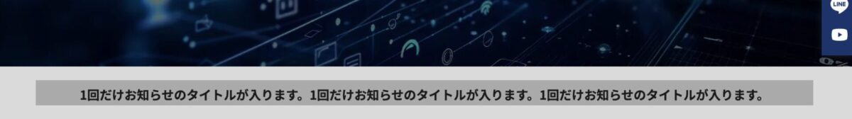
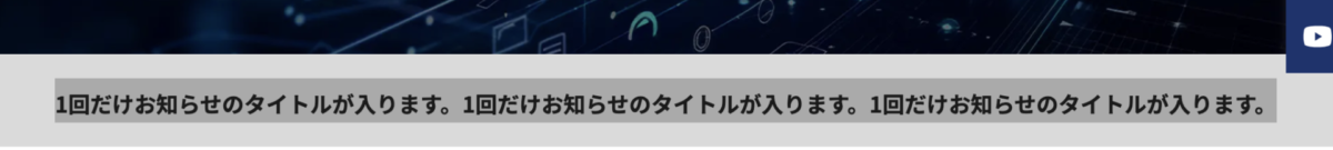
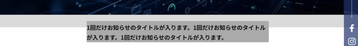
例えばこの画像で言うと、
「1件だけお知らせのタイトルが入ります。1件だけ……」のところは
「text-align: center;」(行揃え:中央寄せ)にしないほうがいいかも。
というお話をしていきます。
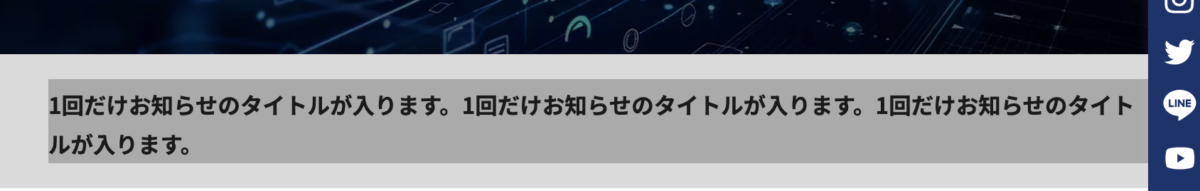
「text-align: center;」がマズイ理由
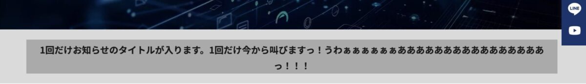
画面幅が変わったり、文字数が変わるといずれ折り返しが発生します。
折り返して2行目になった文字も中央に寄るので、
コンテンツの位置によっては読みづらくなったり見栄えが悪くなります。
(見た目で分かりやすくするため、文字の領域の背景色を変更しています。)
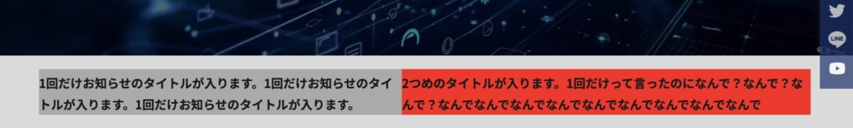
↓文字数が変わると(画面幅が狭まると)
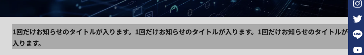
こうなるのを防ぎたいので、文字はデフォルトの「左寄せ」のまま、
文字数が少ない時は中央に配置される状態を目指します。
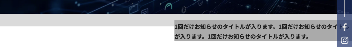
目指す挙動↓

↓文字数が増えると(画面幅が狭まると)
「text-align: center;」以外で文字を中央に配置するCSS
おすすめ度:高
「width: fit-content;」+「margin-inline: auto;」
おすすめ度:中
「display: flex;」または「display: grid;」+「margin-inline: auto;」
おすすめ度:低(文字の配置調整での使用はおすすめできません)
「position: absolute;」+「left: 50%;」+「transform: translateX(-50%);」
ひとつずつ解説します。
「width: fit-content;」+「margin-inline: auto;」
HTML
<p><a href=””>1回だけお知らせのタイトルが入ります。1回だけお知らせのタイトルが入ります。1回だけお知らせのタイトルが入ります。</a></p>
</div>
CSS
padding: 2rem 5%;
background-color: #dadada;
}
.news_wrapper p{
font-size: 1.8rem;
font-weight: 700;
background-color: #aaa;
width: fit-content;
margin-inline: auto;
}
pタグに「width: fit-content;」と「margin-inline: auto;」をあてます。
・「width: fit-content;」←中のコンテンツに幅を合わせる。
・「margin-inline: auto;」←左右余白をいっぱいに。
(「width: fit-content;」の代わりに「display: inline-block;」でも、コンテンツに幅を合わせられます。)
↓画面幅を縮めると
「display: flex;」または「display: grid;」+「margin-inline: auto;」
HTML
<p><a href=””>1回だけお知らせのタイトルが入ります。1回だけお知らせのタイトルが入ります。1回だけお知らせのタイトルが入ります。</a></p>
</div>
CSS
padding: 2rem 5%;
background-color: #dadada;
display: flex;
}
.news_wrapper p{
font-size: 1.8rem;
font-weight: 700;
background-color: #aaa;
margin-inline: auto;
}
.news_wrapperに「display: flex;」または「display: grid;」を、
pタグに「margin-inline: auto;」をあてます。
・「display: flex;」←中の要素を横並びにする。
・「display: grid;」←格子状にブロックで区切り、中の要素をレイアウトする。
「width: fit-content;」+「margin-inline: auto;」と同じ挙動になりますが、
もしお知らせが2つ必要になった場合を考えると、少々おすすめ度が下がります。
(要素が二つ以上になると横並びになってしまいます。回避するには更にdivタグで囲うなどの対策が必要になります。)
「position: absolute;」+「left: 50%;」+「transform: translateX(-50%);」
HTML
<p><a href=””>1回だけお知らせのタイトルが入ります。1回だけお知らせのタイトルが入ります。1回だけお知らせのタイトルが入ります。</a></p>
</div>
CSS
padding: 2rem 5%;
background-color: #dadada;
position: relative;
}
.news_wrapper p{
font-size: 1.8rem;
font-weight: 700;
background-color: #aaa;
position: absolute;
left: 50%;
transform: translateX(-50%);
}
(.news_wrapperに「position: relative;」を、)
pタグに「position: absolute;」「left: 50%;」「transform: translateX(-50%);」をあてます。
・「position: absolute;」←親要素を基準に絶対配置を指定。(かなり自由な配置が可能。)
・「left: 50%;」←親要素を基準に左から50%の位置に。
・「transform: translateX(-50%);」←自身の横幅を基準に50%左へ移動。
おすすめできない理由は以下の画像をご覧ください。
CSS指定前。

↓「position: absolute;」を指定。

なんと「.news_wrapper」の高さが変わってしまいます。
↓「left: 50%;」を指定。
移動した分、文字の折り返しが発生してしまいます。
↓「transform: translateX(-50%);」を指定。
折り返した状態のまま位置を移動してしまいます。
以上の挙動から、文字の配置調整にはおすすめできません。
おわりに
さて、「text-align: center;」以外で文字を中央寄せよせする方法を3点ご紹介しましたが、
基本的には一つ目に紹介した
「width: fit-content;」+「margin-inline: auto;」
が一番使い勝手が良いので、基本的にはこの方法だけでも覚えて使っていければ良いと思います。
「position: absolute;」「left: 50%;」「transform: translateX(-50%);」のように
「position: absolute;」を使えば簡単に位置の移動はできますが、
画面幅を変えると他の要素に被ってしまったり…など思いがけない挙動をしたり、
CSSアニメーションの弊害になったり、良くないことも多いので、
「position: absolute;」での位置調整は、個人的には極力避けたいです。
以上です!


 PREV
PREV